Skin Cushion Dr David Jack
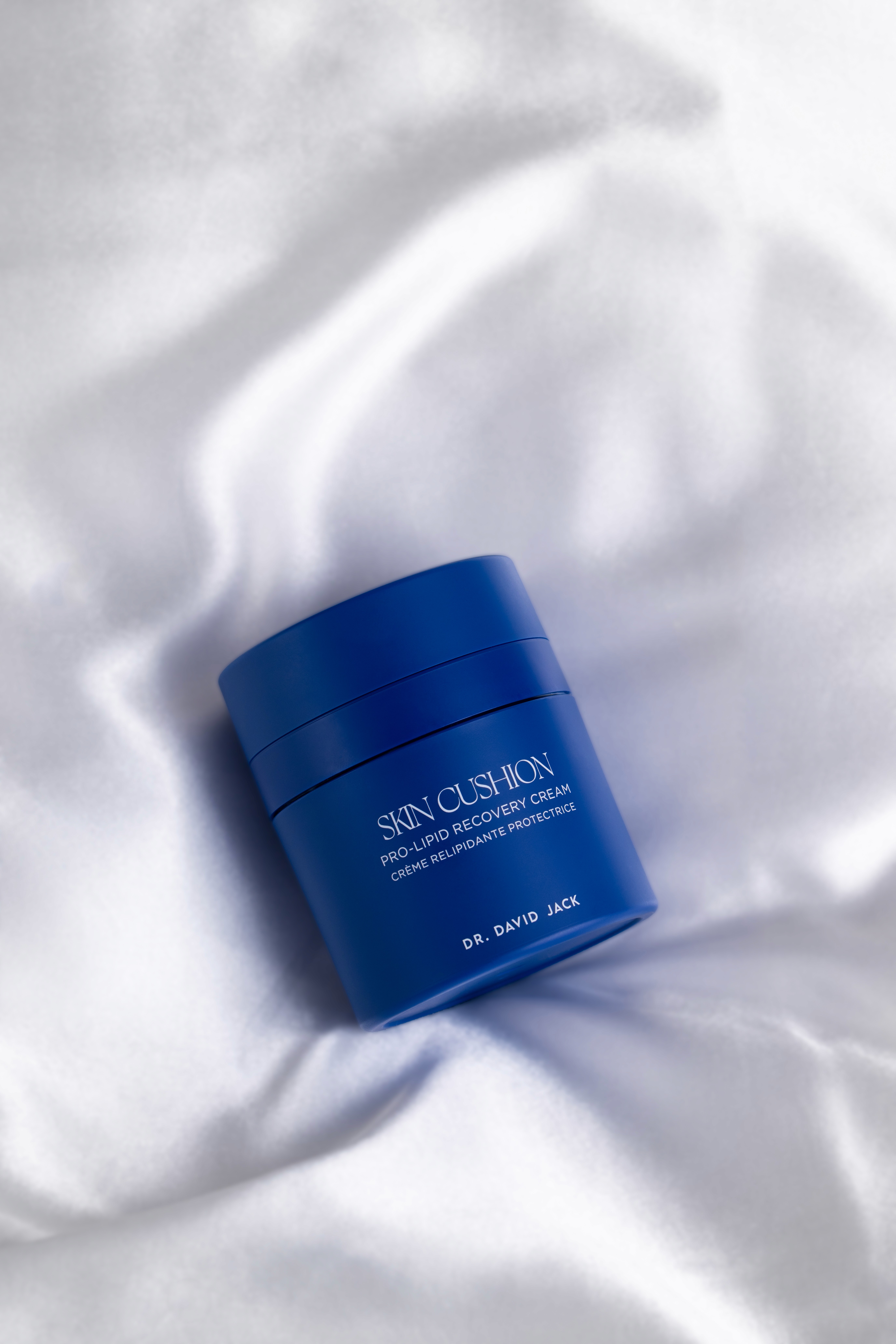
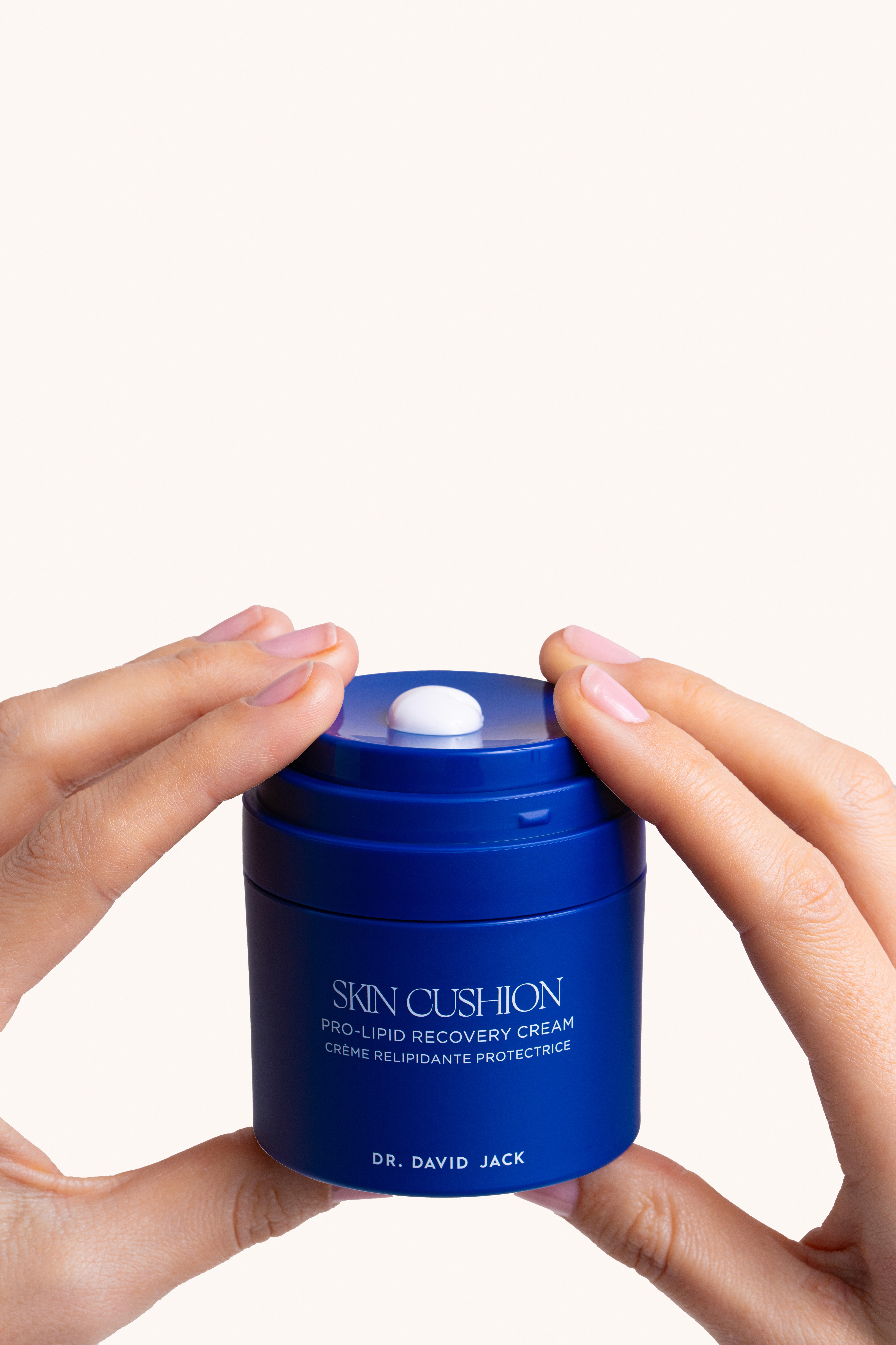
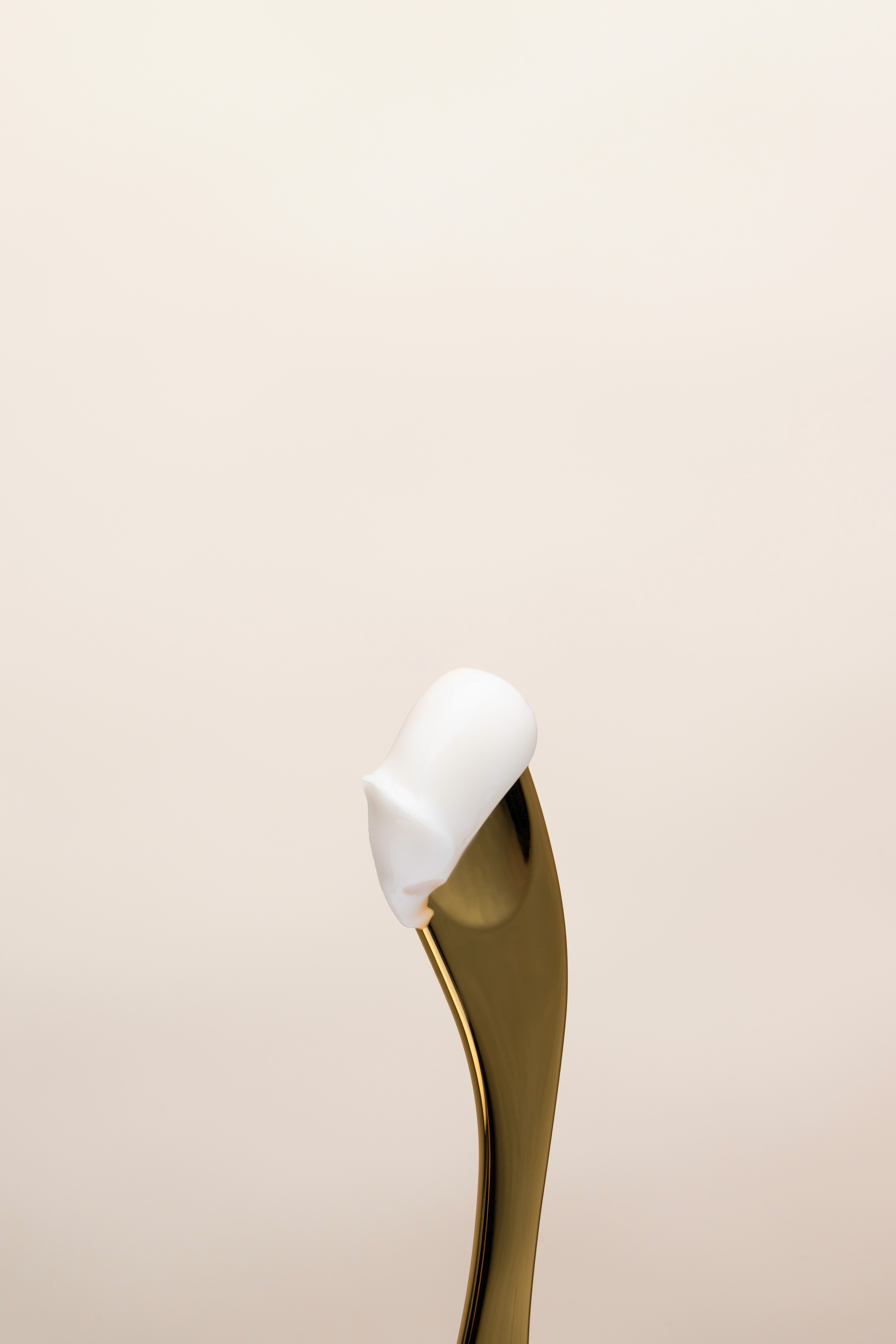
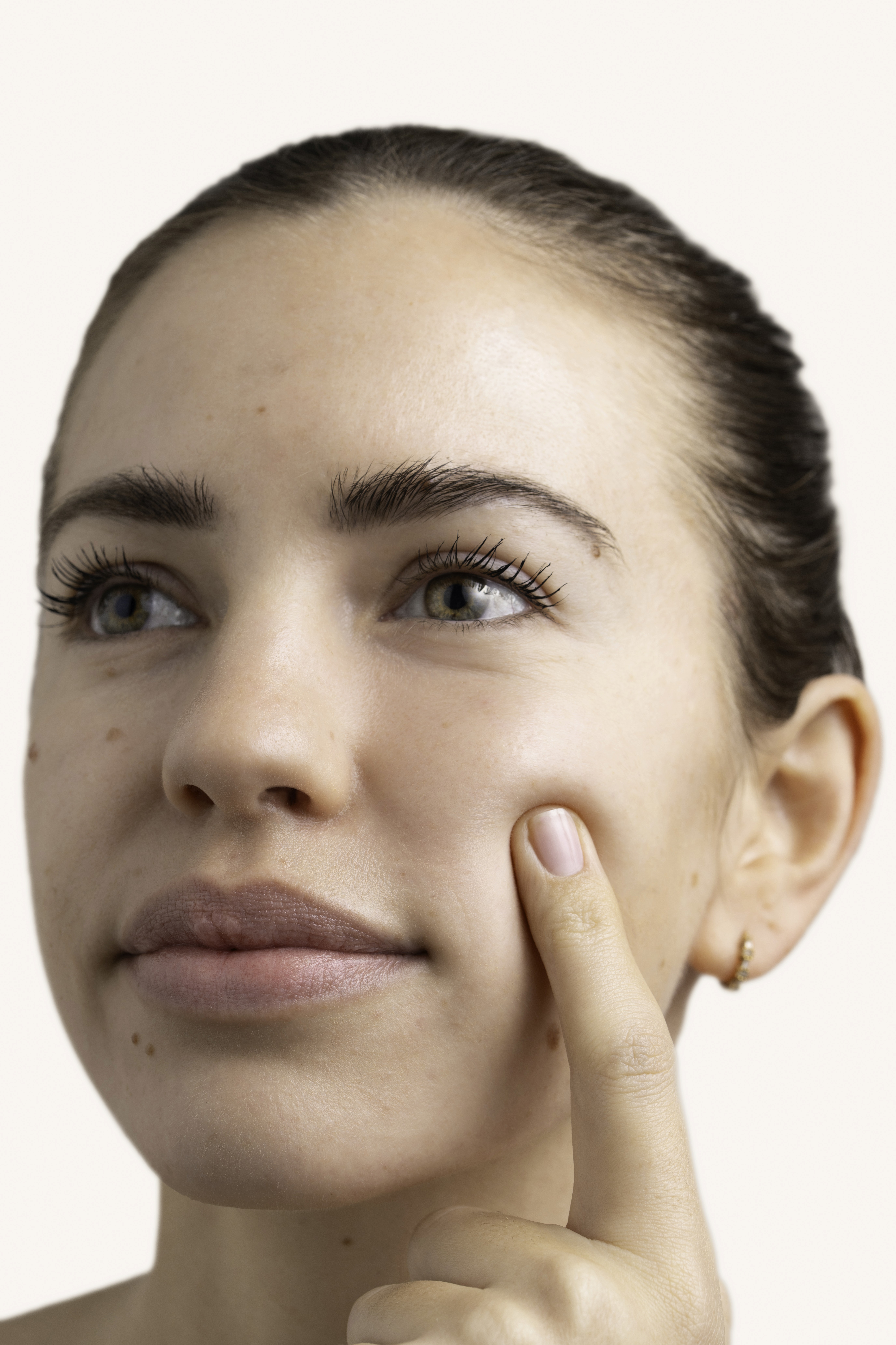
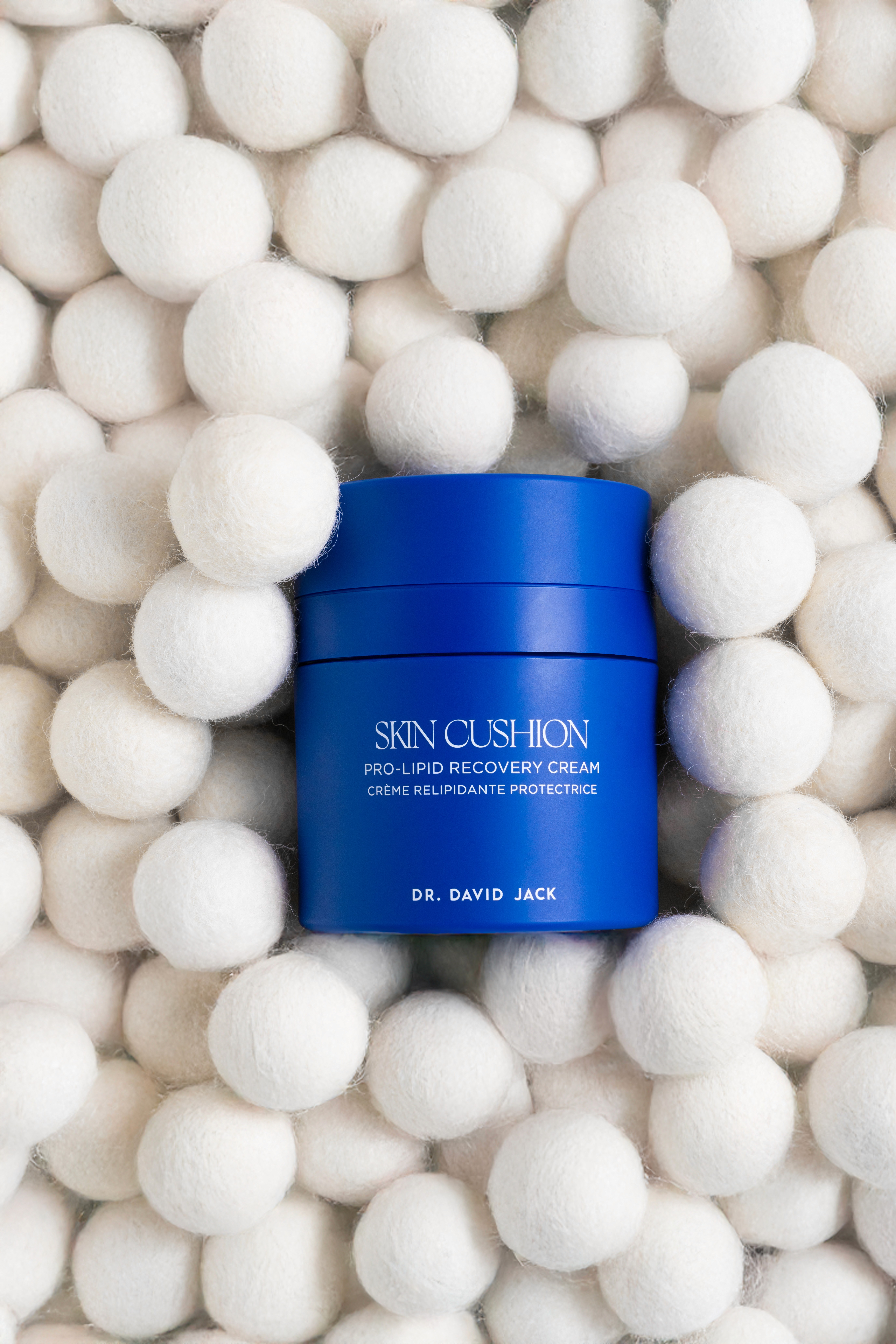
To mark the launch of Dr David Jack's new Skin Cushion, we set out to create a visual direction that felt unmistakably fresh, bright, and entirely new for the brand. For the first time, Dr David Jack leaned fully into colour, using the product’s signature blue as the foundation of the story. Blue props and tactile materials became central to the imagery, amplifying the product’s identity while signaling a bold evolution in the brand’s visual language.
Type
Campaign Production
Date
August 2025
Service
Campaign & Content Development
Client
Skin Cushion Dr David Jack
Synopsis
The brief: Launch visuals for the new Skin Cushion, a direction that felt fresh, bright and entirely new for the brand.
The insight: Dr David Jack had never leaned into colour through their campaigns before. The Skin Cushion's signature blue was an opportunity to signal evolution, not just launch a product, but only if the colour was allowed to lead, not sit in the background.
The creative: Blue became the foundation of the story rather than an accent, carried through props and tactile materials across every shot, making the product's identity stronger.
The result: A bold evolution in the brand's visual language, marking a clear before-and-after in how Dr David Jack shows up visually.
Client
Production: Juliet Rees Jones
Photographer: Jonathan Clifford
Makeup & Hair: Millie Glenister
Retouching: Jerri Nagel